Better proportioned, equal width of belt, boot adjustment, improved side view of pelt head.
Also finalizing designs on the flagon. Colour versions soon...I hope.
Tuesday, June 28, 2011
Thursday, June 23, 2011
Round Up of Wednesday Meeting (22/06/2011)
So last night I was able to show the team the new work, and to discuss changes and make more concrete decisions of our design brief. Good thing is they like where the boss design is going as well as the environment.
Overall there are only minor adjustments to make with all designs, but it's all heading in the right direction.
Here are some notes of changes and preferences:
Enviro: No spiral ramp, refine persp and top view. No pitfalls of death.
Crystal columns attach to stalactites straight up (maybe try curved). Shockwave from charged hits by player on each column breaks the top group of stalactites to fall onto boss.
Weapon: Ditch amulet. Power source at the grip and butt of sword.
More designs.
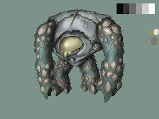
Boss: orange/green/purple flesh preferred
Break up chest armour
Blend plates to armour (colour)
Head more fleshier
Animations in fleshy eyebrows.
Eyes are the biggest feature.
Examples: infinity blade attacks
Flagon: bottom left, opening narrower and cork of previous concepts.
And the Colour combinations of the boss:
We're are also still trying to come up with a decent title for our demo game, hopefully something will stick soon ^_^
Wednesday, June 22, 2011
New learnings and updates
So I found a Youtube channel that teaches some good ways to shade, a problem I've had for a while, I was never happy with it, and I'm still not but the vids helped a lot. Which gave me motivation to come up with another concept, it'll be shown on my team's Skype meeting commencing tonight, hopefully they like the direction it's taken. I've also whipped up a map of what the level should look like, although after some R&R, I should get more motivation and inspiration to come up with a good set of designs for the amulet that our main character will now be using, and unfortunately there's still the problem of the sword design that hasn't been resolved, it's just not right >_<.
Getting there, I think.
Tuesday, June 14, 2011
New Sketches
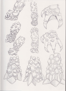
I'm still gradually improving the design of our level's environment while also juggling adjustments for the sword and main character little things, I'm certainly not starting from scratch. The boss design is challenging, but its slowly getting there, I just hope it doesn't look too much like anything else we've seen before.
Friday, June 10, 2011
Weapon update
Now looking at changing the 'crystal' amulet found fused to the sword and making it into a vial of energy. Continuity = win.
Wednesday, June 8, 2011
Re-iteration Commence!
So since our design brief has been changed slightly, and more assignments get knocked down as it gets closer to the semester break, I've finally been able to start adjusting some finer details on some concepts.
We decided that the energy source which is being collected by our hero will now come from within the boss, a liquid form, this is where the flagon will come in. I've had remove the jaw of the skull that holds the flagon so that the bottle is more obvious to the player, and the sword needs to be more worn in to match the main character, so that it looks more believable that he's had this trusty weapon to slay all the other mythical creatures.
Also had to re-adjust the hero's proportions a little, so that the model is easier to rig. The last version looked like he went from crotch to knee, so a 'nude' version has been made, and he's a little taller than before, but is starting to have a neat MMA Heavyweight fighter look to him, and as of today we noticed he looks a lot like Brock Lesnar by chance. Funky.
Waiting on confirmation and more feedback for now, so back to writing my exegesis and chilling out for a bit.
I'm not so pent up and stressed now that there isn't as many assignments to get in the way of my practical work.
 |
| Wear and tear added. |
 |
| Other flagon designs |
 |
| Proportions sketched |
 |
| Re-iterated Proportions |
 |
| Brock Lesnar |
 |
| Creepy. |
Tuesday, June 7, 2011
Update from 6/06/2011
Trying to get my quick painting on. Recently my sketches have been on an artbook, so I'll be scanning and posting them up soon.
Saturday, June 4, 2011
Bday drawing
For my friend Mariel, her birthday was last thursday.
I've been super busy with finishing up essays for the semester, so concepts for the project have slowed.
The team and I did have a meeting last tuesday (30-5-2011) that solidified more parts of the game design brief.
Showed them a new concept I did in my artbook, and the good news is they like the direction it was going, so once the essays are over with I'll be back onto them and posting again.
Have a good weekend internet.
Subscribe to:
Comments (Atom)


